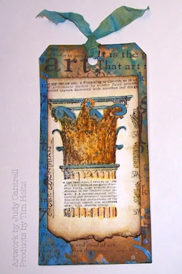
It's been awhile since I worked on a 12 tags of 2013 so early in the month. I used Tim's directions but used what stamps I had that would complement the type of technique he used.
You can see Tim's gorgeous tag here: http://timholtz.com/12-tags-of-2013-june/
You can see Tim's gorgeous tag here: http://timholtz.com/12-tags-of-2013-june/
I love Tim's Distress Paints. I held back buying any because I thought they were the same as acrylic paint. After buying 3 bottle I knew I wanted more. I don't have all he has but do have some that complement each other. And don't get me started on Tim's distress markers, these are very nice too.
I don't think the architecture piece from Classics#2 was intended to be colored like this but it coordinated with the beautiful blue background using the Salty Ocean distress paint.
(Note: distress markers were used on architecture piece)
(Note: distress markers were used on architecture piece)
I used Tim's tag die, Tim's Distress Markers, Tim's Distress Paint, Tim's Classics #2, Archival Black ink, Heat it tool, Strathmore Watercolor cold press,
Water brush, Distress paints on trim, Manila card stock and Spray bottle.

5 comments:
That is indeed an interesting take on the architecture stamp that you have created, I hope to get to making mine today but no distree paints so will be improvising again this month!
Sally
I like it! I like the way the architecture stamp came out! Great job Judy!
Your tag is beautiful!
This is clever, I wouldn't have thought of using this stamp but it works beautifully!
Ooh, it's lovely. The colours all tie in together so well.
Post a Comment